
OPTION 1
I feel this is most in line with what you were after so wanted to include it
OPTION 2
I feel that having the text at the bottom a bit smaller it leads your eyes over the full design a bit more

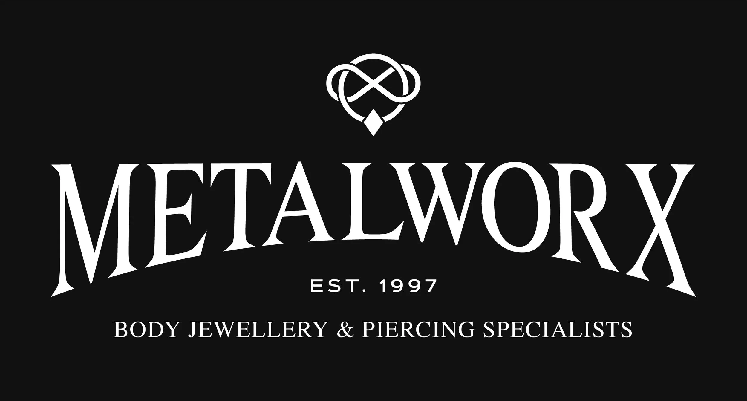
OPTION 3
I feel this is personally my favourite option, it is the same as option 2 but it has the bottom text even smaller.
you might want it bigger however just to make sure it is legible

This is just option 3 however I have enclosed it in a white border - I think bordering it in together might be a good option for the boxing ads because if another sponsor is below you for example it means that people will know all elements of this logo apply to metalworx
(hopefully the makes sense, I just mean people will know the tagline at the bottom is your tagline, not the top of the next sponsor

Again, this is just option 3 enclosed a little more creatively, if you preferred this option it might be better to make the outside box a little slimmer just so it doesn’t over power the logo
Again, I think this might be better just for the boxing sponsors not for merch

Same again with thinner box enclosing it
I think for sponsors this is my favourite - Totally your call however as it is your brand and you know it best!